Tikuna Rebranding
Case Study
Project Type:
Branding, Visual Identity, Packaging Design, & Web Design
Role:
Project Manager, Lead Designer & Digital Illustrator
Tools:
Illustration, Photoshop, Adobe Premiere, Trello & Figma

Challenge
Tikuna, a Peruvian artisanal chocolate brand, goes beyond crafting delectable chocolates. Rooted in the Amazon rainforest, it is dedicated to empowering the indigenous Tikuna community. Through each chocolate, Tikuna shares the rich cultural heritage and traditions of the Tikuna people, creating a meaningful bridge between consumers and the vibrant community they support. The challenge for this project was to enrich the cultural identity of the Tikuna Community while highlighting the cacao production process in Peru.
Solution
This project aimed to enrich the cultural identity of the Tikuna Community and highlight the cacao production process in Peru. Through intricate patterns, illustrations, packaging, and a thoughtfully designed logo, the focus was on capturing and celebrating the essence of Tikuna's heritage and the journey of cacao production in the region.
PHASE 1
Research and Analysis
In a competitive market sector, the primary goal of the Tikuna rebranding project was to create a strategy that would enable the brand to stand out in the national market and expand its sales across various provinces of Peru. The project commenced with an in-depth research phase, which included a market analysis (audit) of national and international competitors. This analysis covered physical and digital touchpoints, brand identities and concepts, and the effectiveness of online strategies.
We conducted a survey with
80
participants
to gather their opinions on the current brand, focusing on its digital touch points, online shopping experience, and overall brand perception.
Demographic profile
Age Range: 23-50 years
Socioeconomic level: A & B
Location: Lima, Peru
Stakeholders
Internal: Production Workers & Sales Team
External: Customers & Suppliers
Plus for the research aspect, we dove deep into the chocolate world—eating a lot of chocolate along the way! We visited main competitors, ordering their chocolates online to experience their websites, delivery processes, and packaging designs firsthand.

Key Findings
1. Brand Recognition: The survey revealed that most participants did not recognize the Tikuna brand. Despite offering a good product at a competitive price, the brand's accessibility and ease of contact were lacking, leading consumers to choose other chocolate brands.
2. Design Weaknesses: Compared to other brands in the national and international markets, Tikuna's design was weak and failed to connect with users when displayed on shelves.
The analysis concluded that while the current brand concept was strong and distinctive, it was not effectively reflected in the packaging, branding and overall user experience.
Therefore, a new brand identity was needed to align with the brand's story and enhance its digital presence, particularly through its website and social media. Given the brand's focus on the Tikuna community, it was essential to incorporate their culture into every aspect of the design.
PHASE 2
Logo Design Phase
With a clear direction, we moved into the design phase. This phase began with creating a variety of sketches and logo designs to determine the best direction for the new brand identity. The first step here was sketching and we did several...several sketches and design paths to find the style that

And after putting the logo to the test and pitching it to the clients... The final Tikuna logo emphasized organic, curved shapes that stood out naturally while retaining the community's strength.


PHASE 3
Graphic Guidelines
Our goal was to incorporate illustrations that could be used in packaging and digital media. After testing various styles, we realized they did not fully convey the culture and essence of the Tikuna community. Further research into the Tikuna tribes revealed that each had representative elements and animals.
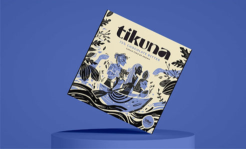
Consequently, we designed each chocolate flavor and type to represent a different tribe, using significant animals and colors to emphasize cultural significance beyond aesthetics. We chose black and white as the primary brand colors, with black holding special meaning as Tikuna translates to "Men of Black."


We drew inspiration from Tikuna textiles, natural resources, and traditions to create digital illustrations forming part of the 360-degree brand identity. Once the illustrations were completed, we proceeded to design brand applications, ensuring a consistent image across all customer touchpoints.


PHASE 4
Web Design
One of the brand's weakest points was its website. We focused on redesigning the website's flow, layout, and communication, incorporating text and graphics to enhance the user experience.
Key Features
Home Page
Highlight key differentiators with clear and engaging visuals. Accompany with an eye-catching banner or hero image with a strong call-to-action (CTA) that invites users to explore the products or learn more about the community.
Menu layout
Color changing icons
Mision of the brand
Mision of the brand
Differentiation
of the brand
Personalized illustrations
About Us Button
Create a tribe...
then sell
Products
Sliders for faster navigation
Product Page Button
Footer

Product Detail
Section
Initially, we created a model highlighting one product that led to the chocolate section. However, testing revealed that a slider was more effective, allowing users to view all three products and select which to purchase. Once it takes you to the product page we focused on showing all the attributes the chocolate holds to create a call to action.
Menu layout
Color changing icons
Product Banner
Call to Action Button
Product Image
Accompanied with the Origin & Ingredients
Chocolate Tasting
Describing sensory assets makes it easier for users to decide.
Footer

About Us
Section
We emphasized the Tikuna community with storytelling, starting with the phrase: "Chocolate Bars with History: Our journey begins deep in the Peruvian Amazon with the Tikuna Community." This section included a short legend about Tikuna mythology and an educational video showing how each purchase supports the Tikuna community.
Menu layout
Color changing icons
Showing what they sell
Chocolate bars with history
Mythology of the community
Community Commitment
Helping the community with each chocolate bar
Video showing the elaboration of the chocolate
Footer

PHASE 5
Brand Applications
Understanding that the brand extends beyond packaging, we designed uniforms, brochures, stands, and props to ensure a consistent image at all customer touch points. For their digital presence, we developed social media templates showcasing the brand's DNA and provided templates for product and external communication.


Ensuring brand consistency across all interactions is crucial as it reinforces the brand identity and builds trust with customers. This physical consistency complements the digital aspect, fostering a holistic approach that creates a seamless and cohesive brand experience, thereby strengthening customer loyalty and recognition.
ROLES
Responsibilities within the project
Project Manager
We began by analyzing each team member's skills and collaboratively assigning roles. I created a Kanban board to plan weekly goals, ensuring all objectives were met within the eight-week deadline. The process focused on two pillars: research and design. Half the team continuously researched the community, while the other half transformed this information into graphics. Weekly check-ups and bi-weekly meetings ensured smooth progress and prepared us for client pitches.
Team Manager
I conducted weekly check-ups with each team member to review their progress and offer assistance with specific tasks if needed. We also held two meetings per week to compile information, present proposals, and create client pitches. This collaborative approach ensured that all team members were aligned with the project's goals and deadlines.
Digital Illustrator
In this project, I had the opportunity to work directly on the digital illustrations and graphic elements for each packaging cover. Once the design was confirmed, these served as the basis for the rest of the brand applications, both physical and digital, carried out by the whole team.
Conclusion
This project allowed me to integrate my skills in project management, design, and illustration to create a cohesive and culturally resonant brand identity for Tikuna. The new branding and website redesign aimed to enhance the brand's recognition and accessibility, ultimately expanding its reach and impact in the national market. Through a well-coordinated team effort and a thorough understanding of the Tikuna community, we successfully delivered a brand that not only stands out but also tells a compelling story.
TIKUNA REBRANDING CASE STUDY